Snax
Brand concept and Launch Campaign
2022 | 4 months | Packaging, Branding
Snax is a concept and launch campaign for a nut-free snack and dessert brand targeted to young adults with severe nut allergies. With a bold, vibrant brand identity and variety of products, Snax aims to provide a fun and engaging brand to help people with severe allergies indulge their cravings without fear.
Context
This project was intended to be our “capstone” as design students - a work-intensive original project meant to showcase our skills in marketing, concept development, design, and presentation. As a culmination of our work up to that point, the project needed to be rigorous, well-defined, and well-researched. However, we were free to define the scope, focus, and deliverables by ourselves, working closely with teachers to make sure the project had an appropriate level of care and polish, and spoke to our learning as designers.
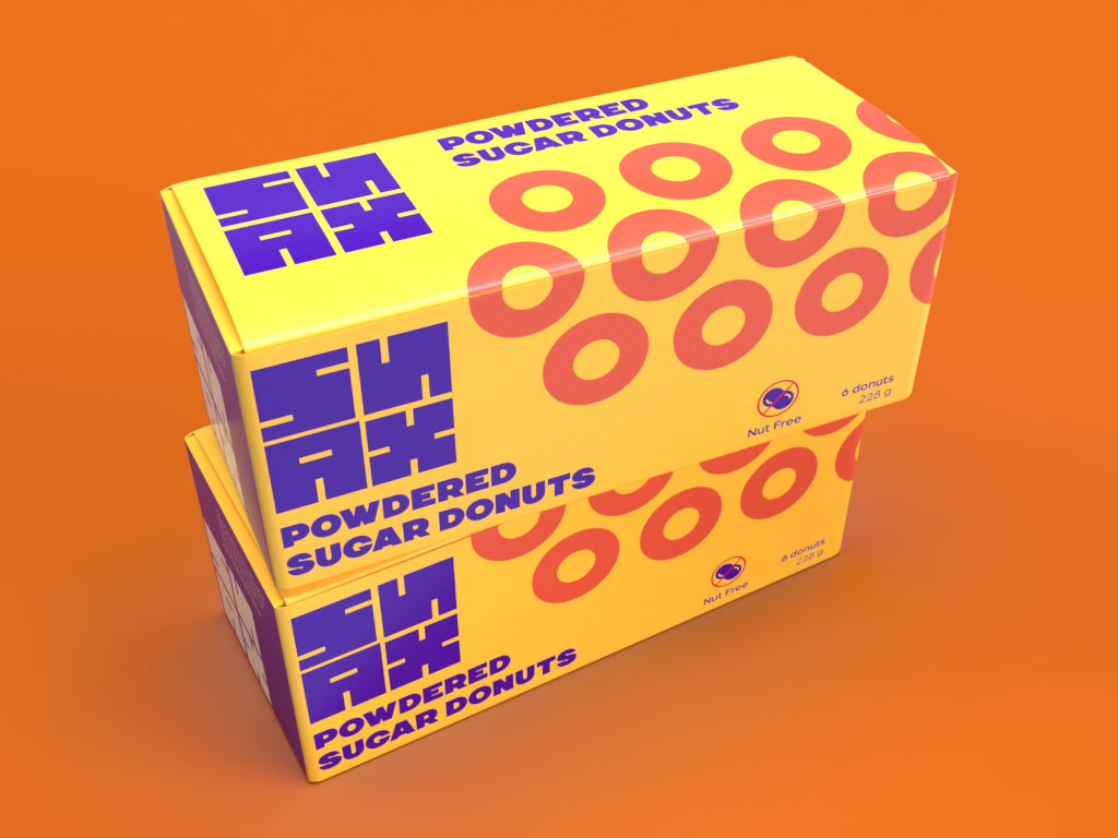
Boxes Top

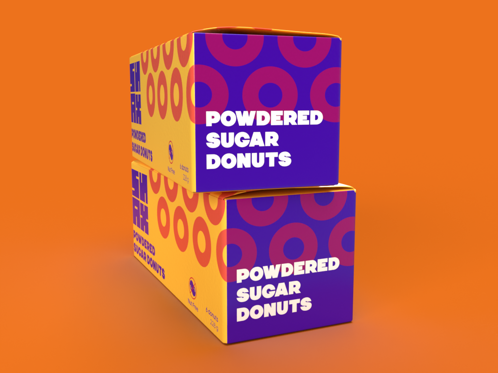
Boxes Front
Boxes Side
In researching concepts and potential markets, I wanted to create a brand or experience that filled an unmet or unknown need, and allowed for a unique and engaging design approach. Drawing from personal experiences and extensive research into statistics and existing brands, I eventually decided to address the issue of severe nut allergies in North America.
Living with severe food allergies means being extremely careful with the foods you buy and can greatly limit your options when shopping. This is especially true when it comes to foods like snacks, candy and desserts - most allergy-free brands in this field are either targeted specifically to children, potentially alienating teens and young adults looking for safe options, or feel limited. A successful brand in this sector would need to feel engaging and sophisticated to draw in older Gen Z customers looking for safe snack options on par with mainstream brands.
Method
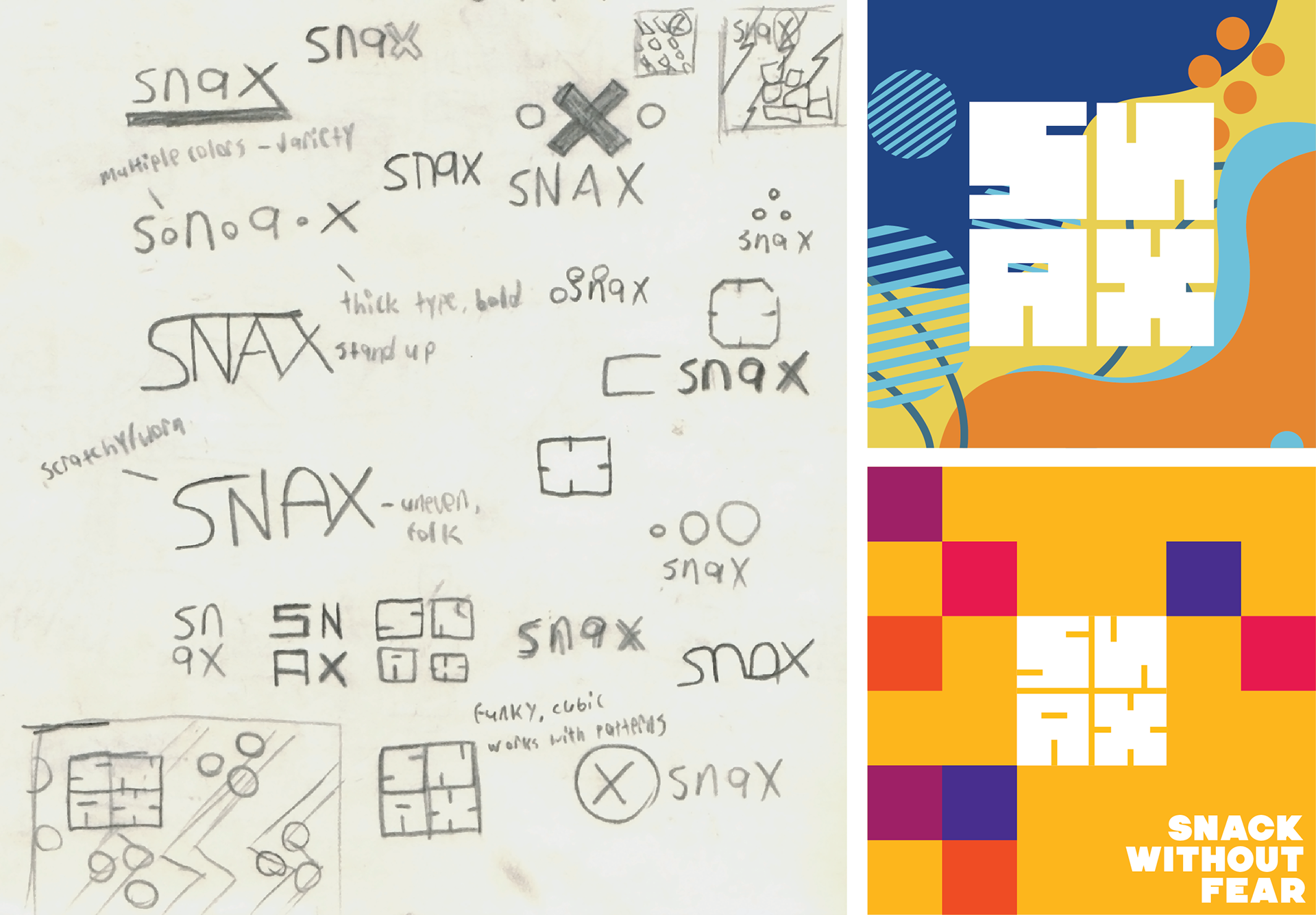
Several concepts, approaches, and design systems were explored
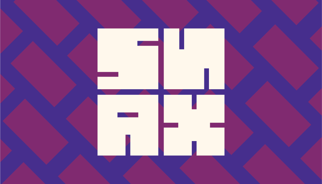
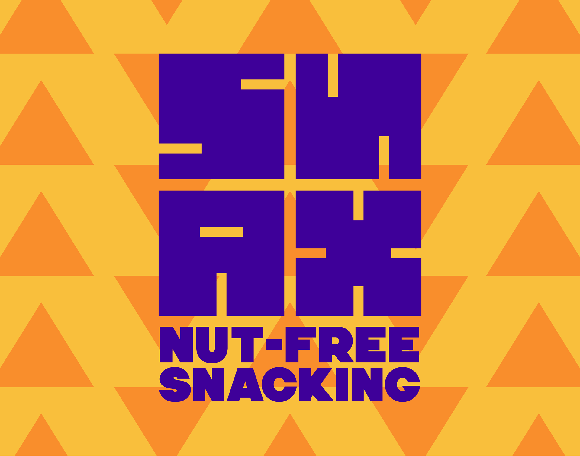
As part of the concept development process, we were tasked with developing two separate visual directions for our chosen projects, presenting them to a panel of designers, and using their feedback to move forward with one of them. For Snax, I wanted to strike a balance between friendliness, vibrancy, and impact in order to make the brand appealing to the target audience. I developed a modular geometric logo and based each concept off of geometric forms to make each feel consistent yet bold and striking. I experimented heavily with various patterns, abstract illustrations, and design systems in order to develop something that felt friendly yet impactful and moved away from the juvenile, dated designs of similar brands.
Solution
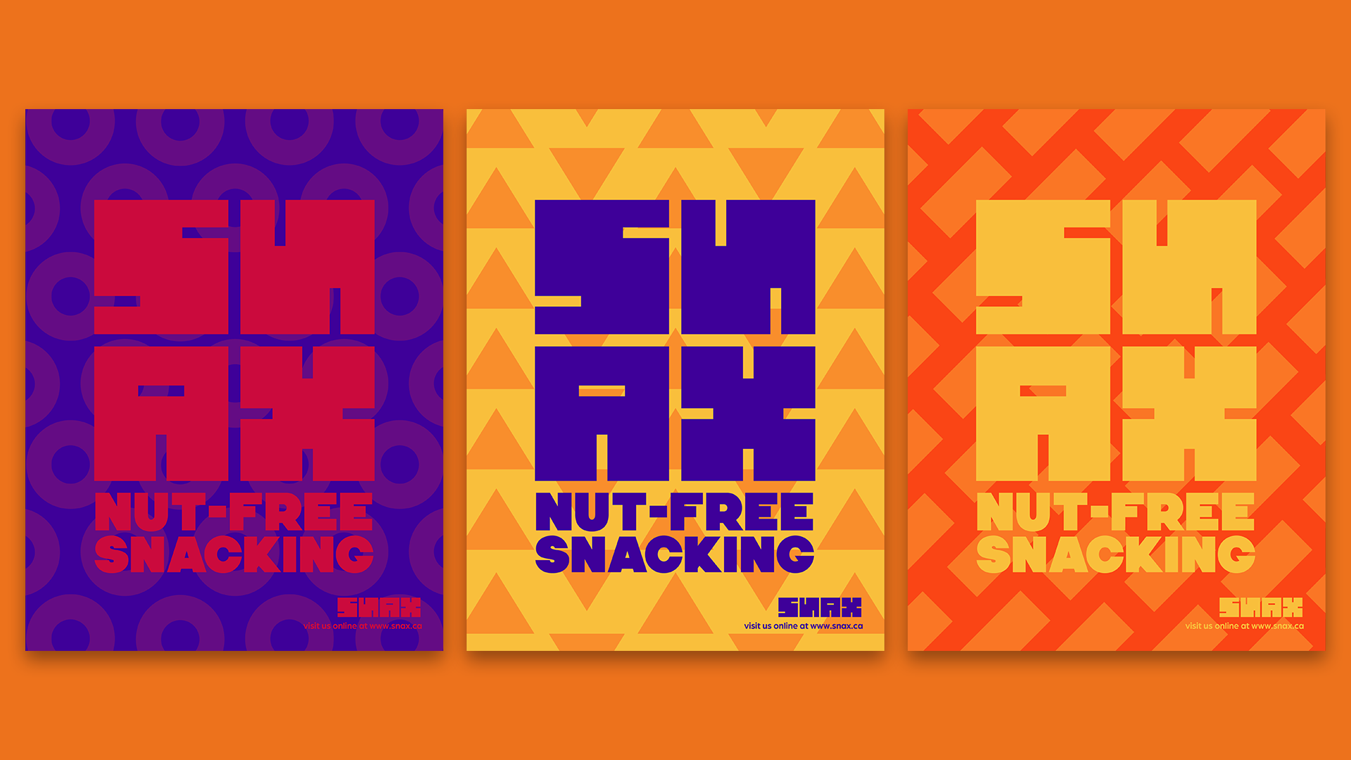
Launch Campaign Posters
After presenting my two concepts, I opted to move forward with a mix of the two. Based on peer and instructor feedback, I drew on the strengths of the brand’s logo to create a set of bold geometric patterns that could be easily rearranged and applied across different applications while keeping a colorful yet sophisticated overall look.
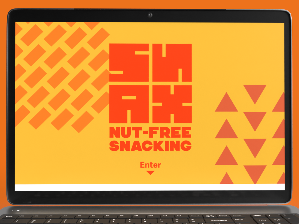
Homepage
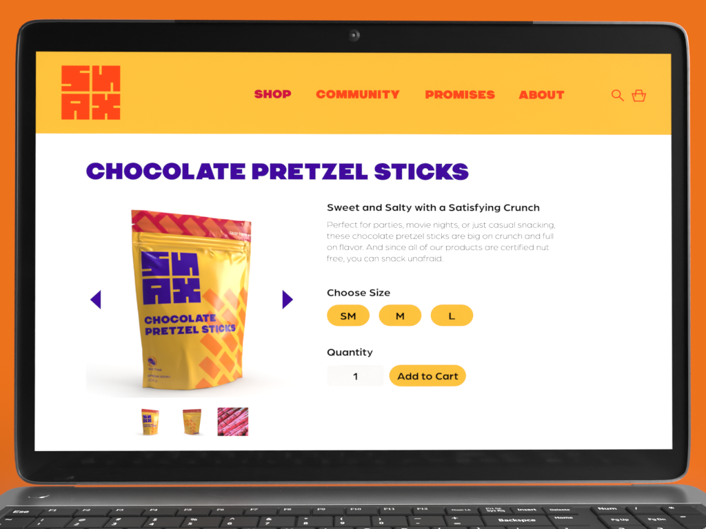
Shop Page
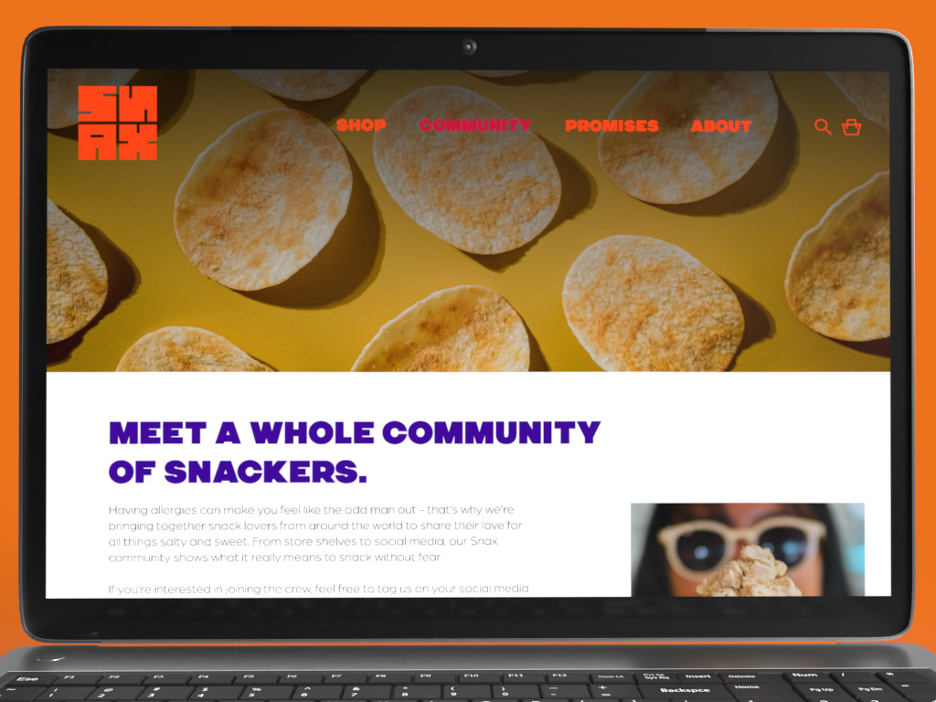
Community Page
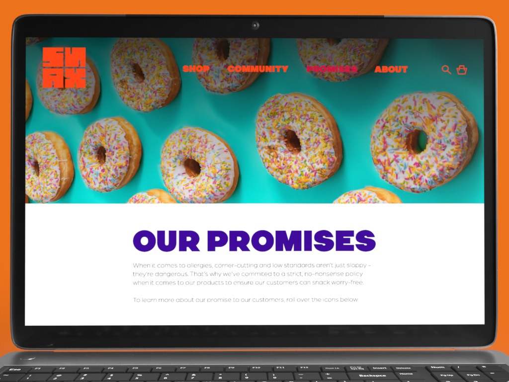
Editorial/Marketing Page
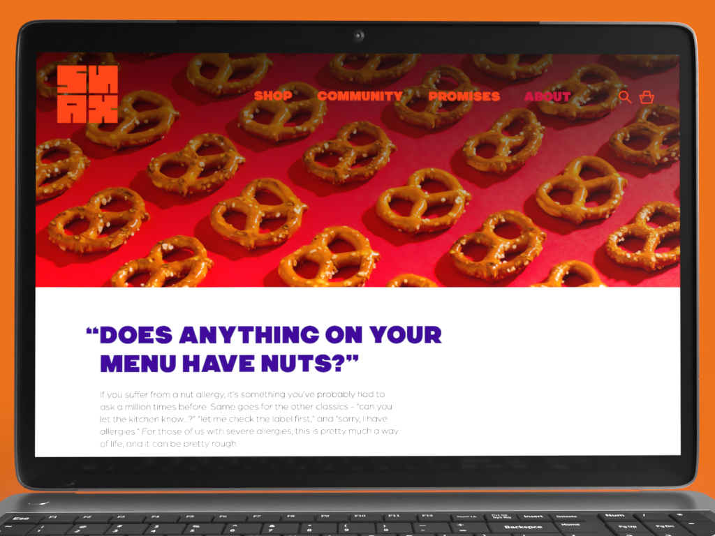
About Us Page
In terms of deliverables, I wanted the brand to feel fleshed-out and authentic, so I developed packaging and brand touchpoints as well as a combined web, social media, and print launch campaign using a unified visual language and brand message. The launch campaign also gave me an opportunity to integrate a stylized, close-cropped photography style that tied into the patterns and colors for a unified look. Using these elements together in a considered way helped move Snax away from juvenile, child-friendly branding for something more sophisticated but still vibrant overall. The brand’s core values of fun and safety still shine through, but the brand doesn’t feel patronizing or exclusively targeted to children.
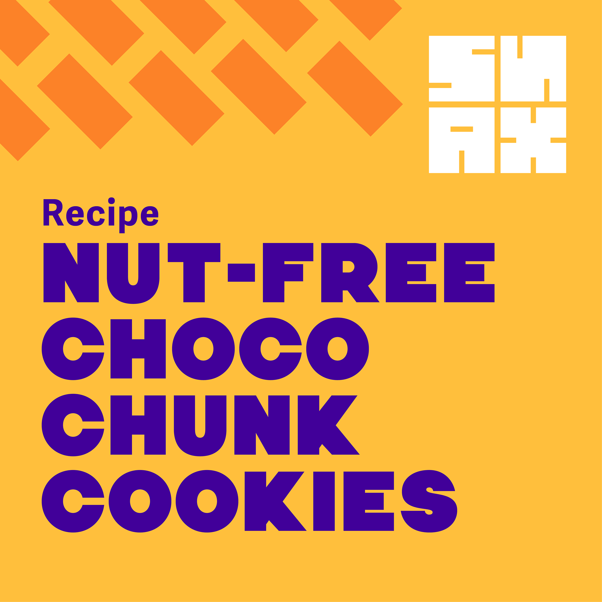
Recipe Post
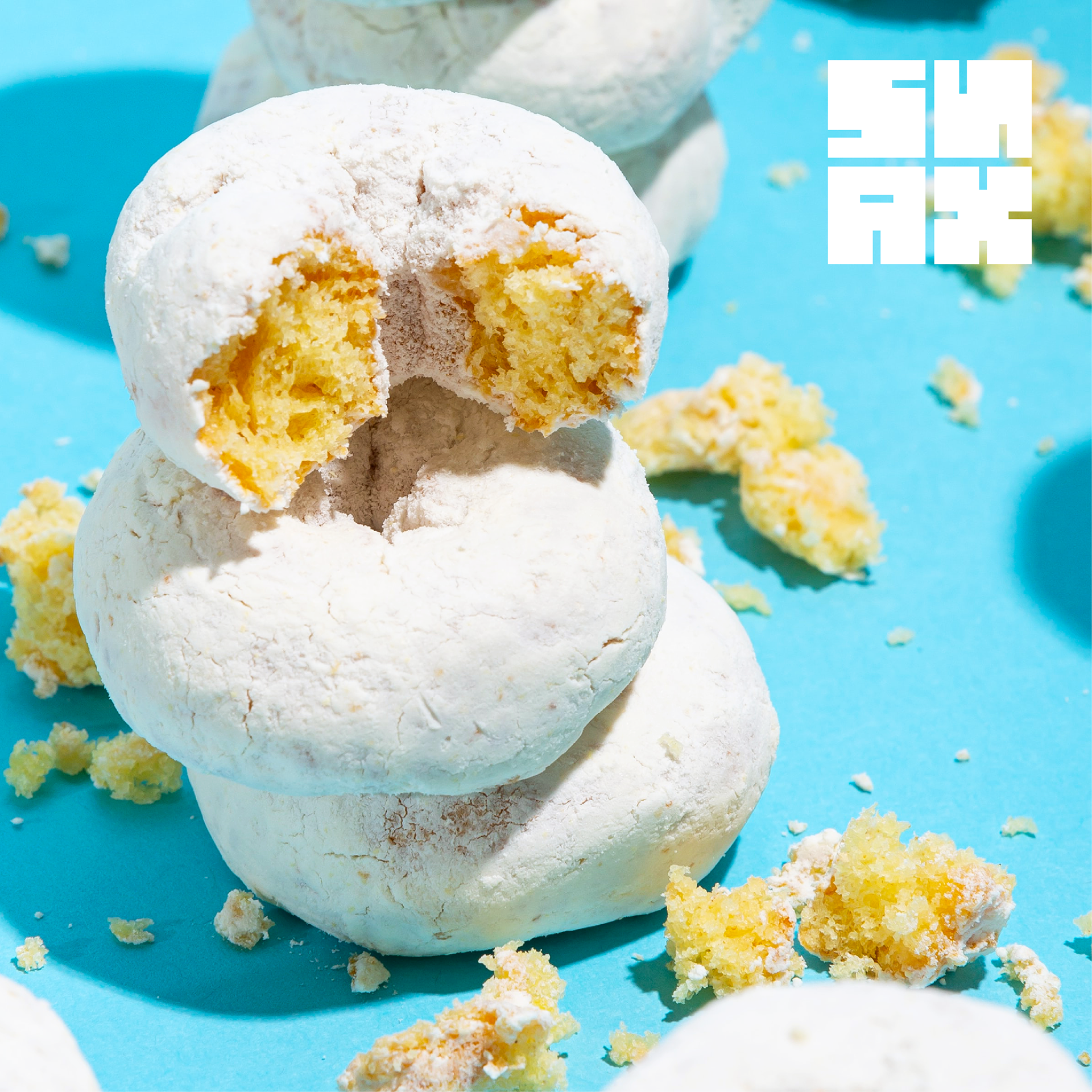
Photo Post

Announcement/News Post

Photo Post
Community Post

Photo Post
Results
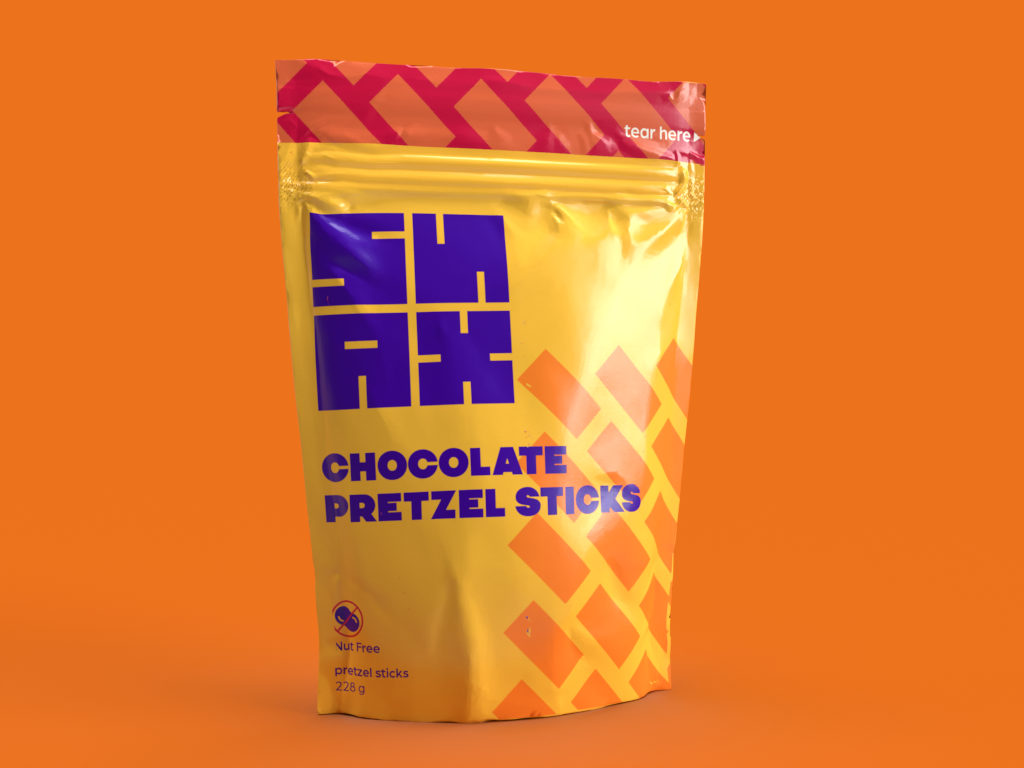
Pouch Front
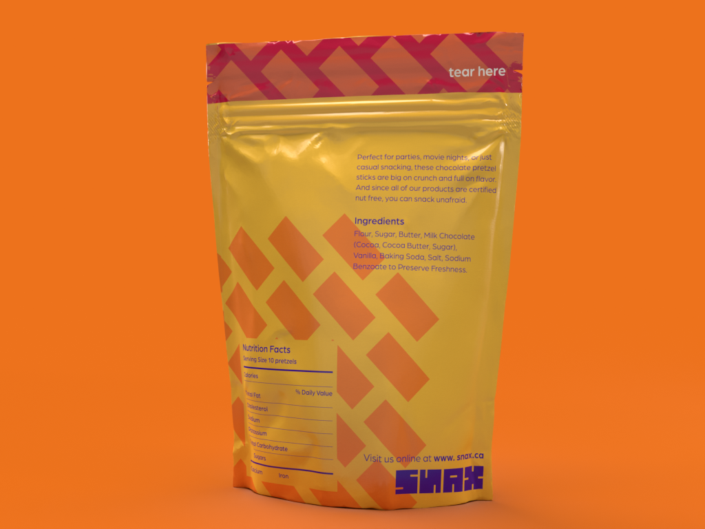
Pouch Back
Throughout the project, I was continually reminded that engaging, impactful design doesn’t need to be overly ornate or complex. A strong, consistent visual language and a well-defined design system can be effective tools for creating large-scale projects that reach an audience or solve problems in a unique way. This is even true for projects involving more frivolous or “fun” brands and products - in fact, these projects can present opportunities for unique and vibrant design, and don’t have to feel childish or amateur in their approach and appeal.
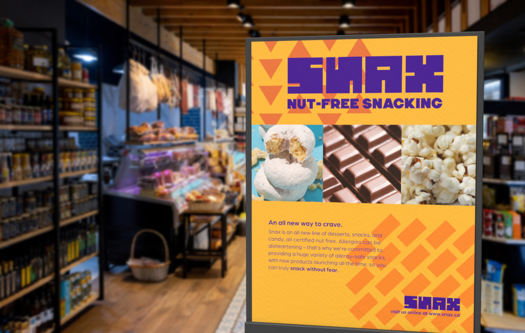
Point of Purchase Display
Snax was also an opportunity to address an issue that, while not as extreme or severe as other social causes, still affects millions of people. Creating a fun, friendly brand that directly addresses an unmet need and brings joy into people’s lives can be highly valuable, both as a product and as a design exercise. Designing for good can take many forms, and projects don’t necessarily have to change the world to impact others and create positive change.
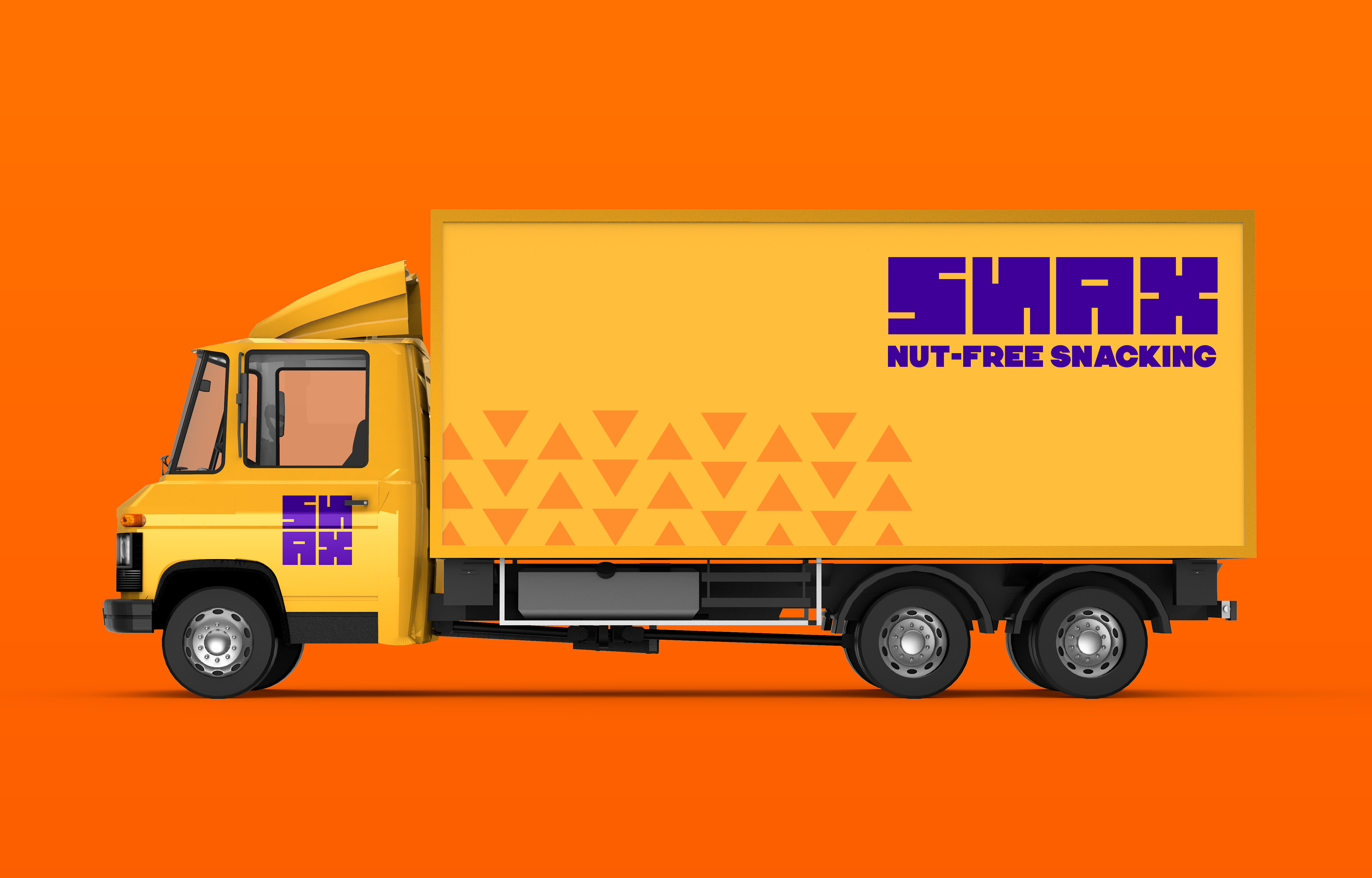
Delivery Truck
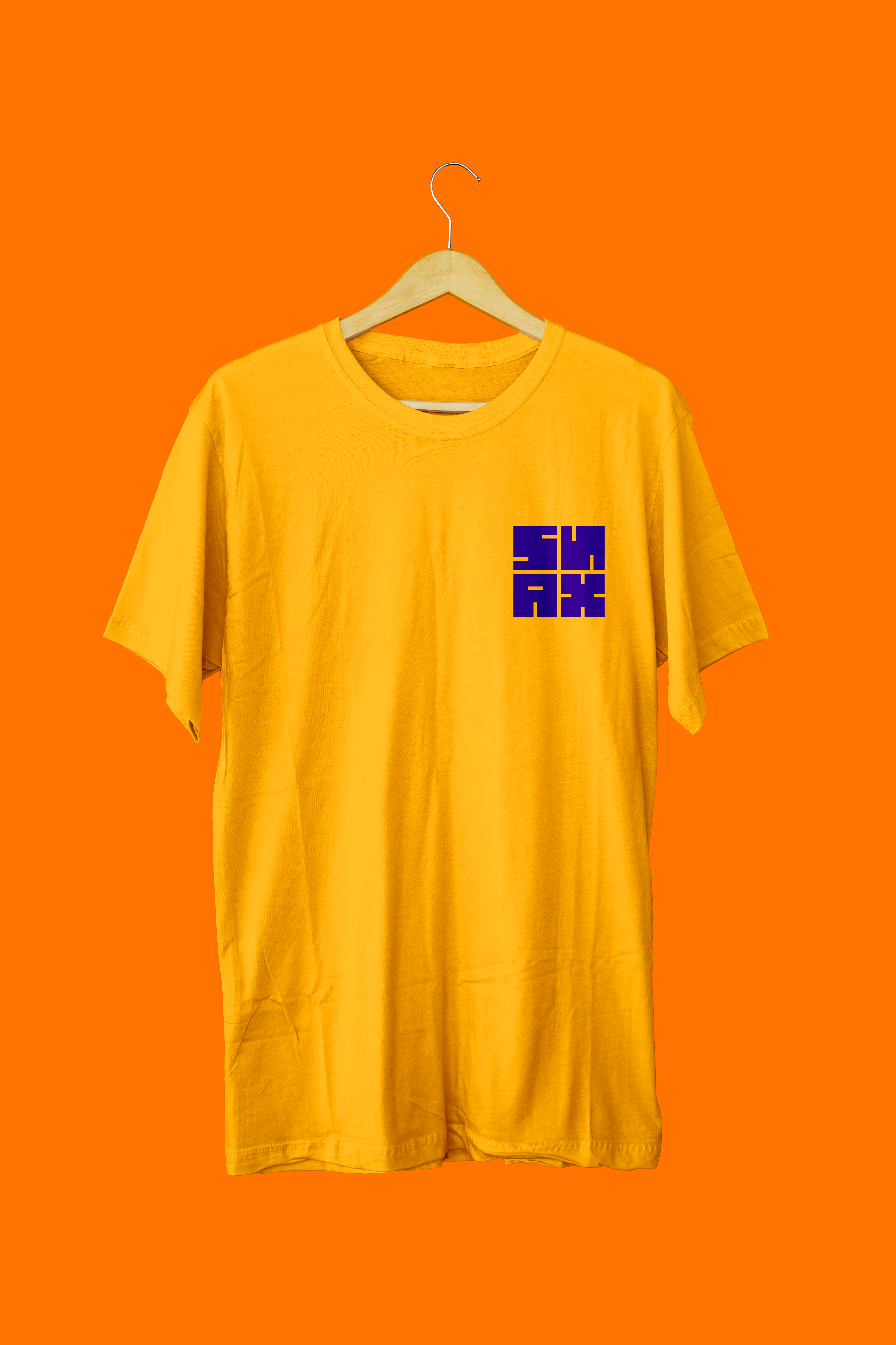
T-Shirt Front
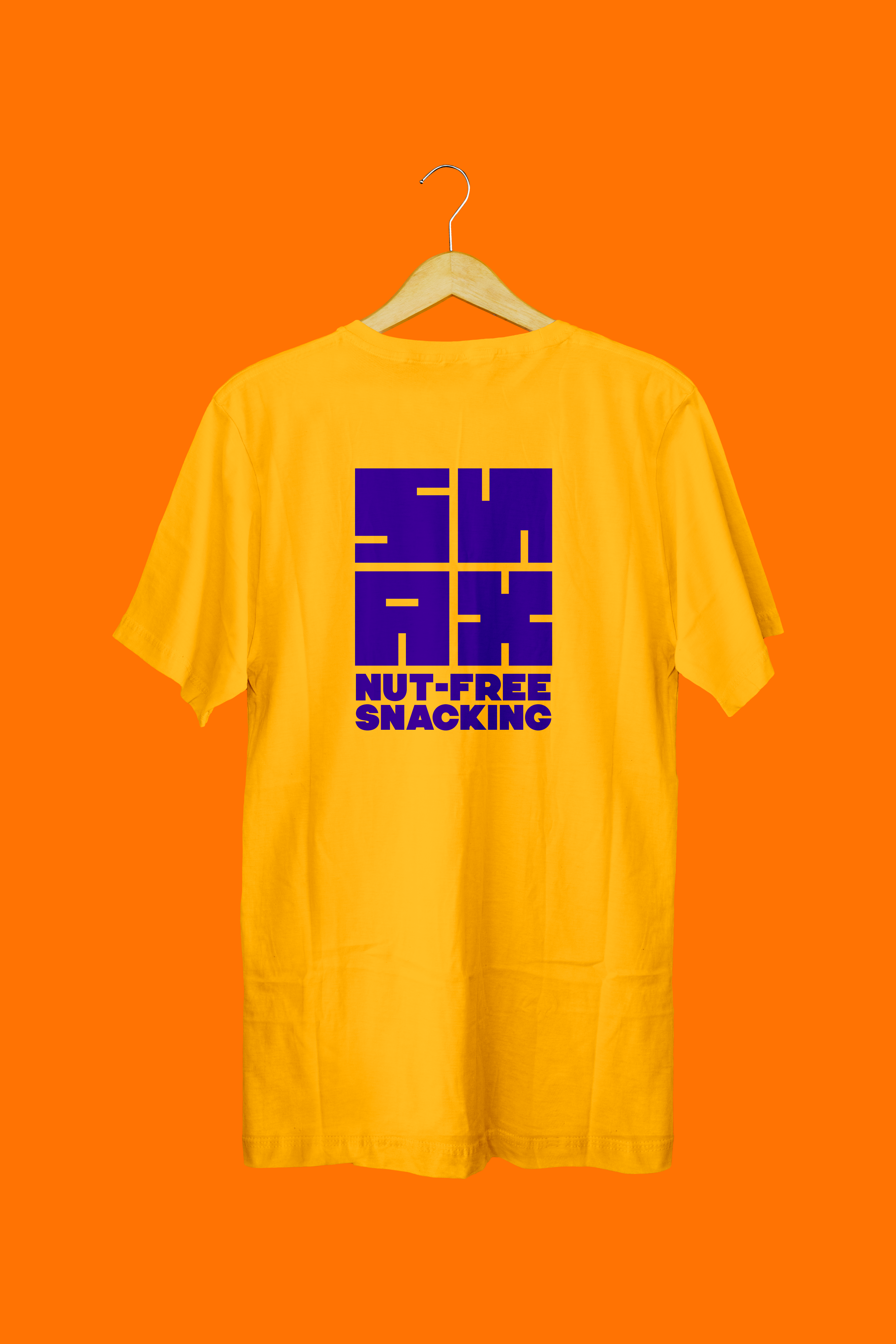
T-Shirt Back
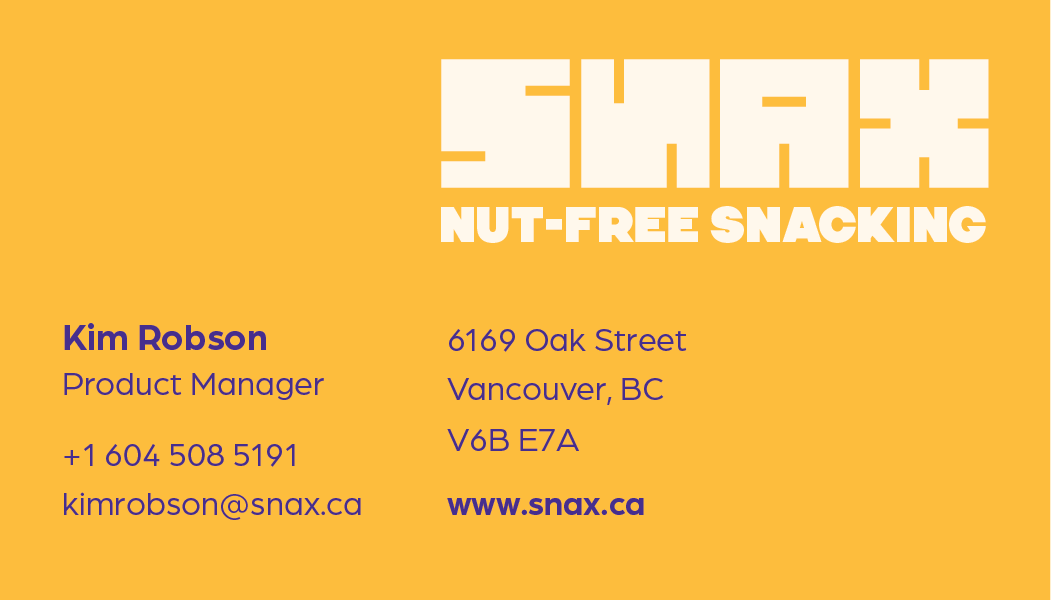
Business Card Front